Jewellery2 min readUpdated
Choosing a background for jewellery photos
A jewellery photo background is the surface behind and beneath a piece, and its main job is to stay neutral enough that the metal and stones keep their true colour.
Early access — jewellery support is in development. Garment and ethnic-wear catalogues are available today.
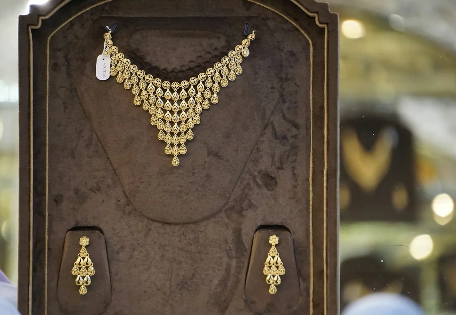
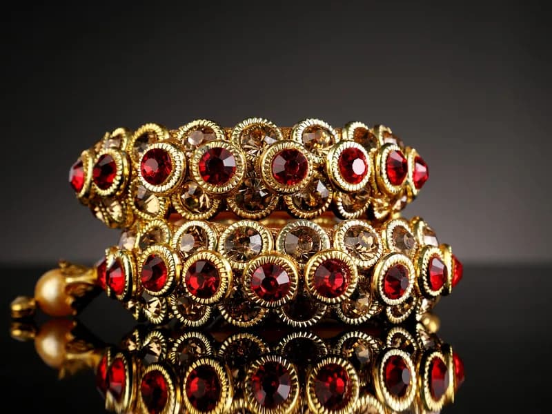
Background choice is usually treated as a styling decision. For jewellery it is closer to a colour-accuracy decision, because anything coloured near a plated surface reflects into it. A red cloth under a gold-plated chain pushes the plating warm; a blue one pushes it grey. The buyer then receives something that does not match the photo.
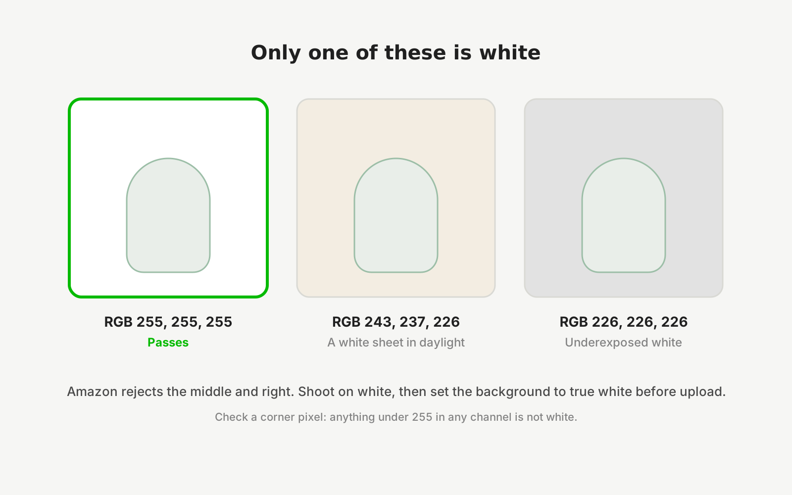
There is also a hard constraint. Marketplace listing rules generally require the main product image to sit on a plain background, so a styled shot cannot be your only image no matter how good it looks.
The practical answer is to shoot the plain version first and treat everything else as secondary.
Backgrounds, ranked for jewellery
- Off-white / light grey
- Best default. Keeps plating tone honest, satisfies marketplace plain-background rules, and shows the outline of both light and dark pieces.
- Mid grey
- Excellent for silver, oxidised and rhodium finishes, which disappear against pure white. Still neutral enough not to tint the metal.
- Black
- Dramatic for diamanté and polki, but hides oxidised silver and dark stones entirely, and is rejected as a main image by most marketplaces.
- Coloured fabric
- Avoid for the main shot. Reflects colour into plating and shifts the apparent gold tone, which is the leading cause of colour-mismatch returns.
- Marble / textured tile
- Works for lifestyle slots. Keep the texture subtle — a busy surface competes with the piece and makes small stones hard to see.
- Skin / on-model
- The best way to communicate scale. Use it as a secondary image rather than the main one.
Whatever you choose, shoot the whole collection on it. Consistency across a catalogue reads as professional far more than any individual background choice.
Questions sellers ask
What colour background is best for jewellery photography?
Off-white or light grey for most pieces, and mid grey for silver and oxidised finishes that vanish against white. Both stay neutral enough that the metal keeps its true tone, and both satisfy marketplace rules requiring a plain background on the main listing image.
Can I use a black background for jewellery listings?
For secondary and lifestyle images, yes — black suits sparkling stones. For the main listing image, usually not: most marketplaces require a plain white or very light background, and black hides oxidised silver and dark stones almost completely.
Why does my gold jewellery look the wrong colour in photos?
Two usual causes. Coloured fabric near the piece reflecting into the plating, or mixed light sources confusing the camera's white balance. Shoot on a neutral grey or off-white surface under a single kind of light, and the tone corrects itself.
Can the background be changed after the photo is taken?
Yes, and it is one of the safer edits because it changes the scene rather than the product. What matters is that the piece itself — its stones, plating tone and design — stays exactly as it is. Restaging the background is fine; altering the item is not.
Start from a photo you already have
Upload one real photo of the product and review the results against your original before anything is published. New studios start with 50 free credits.